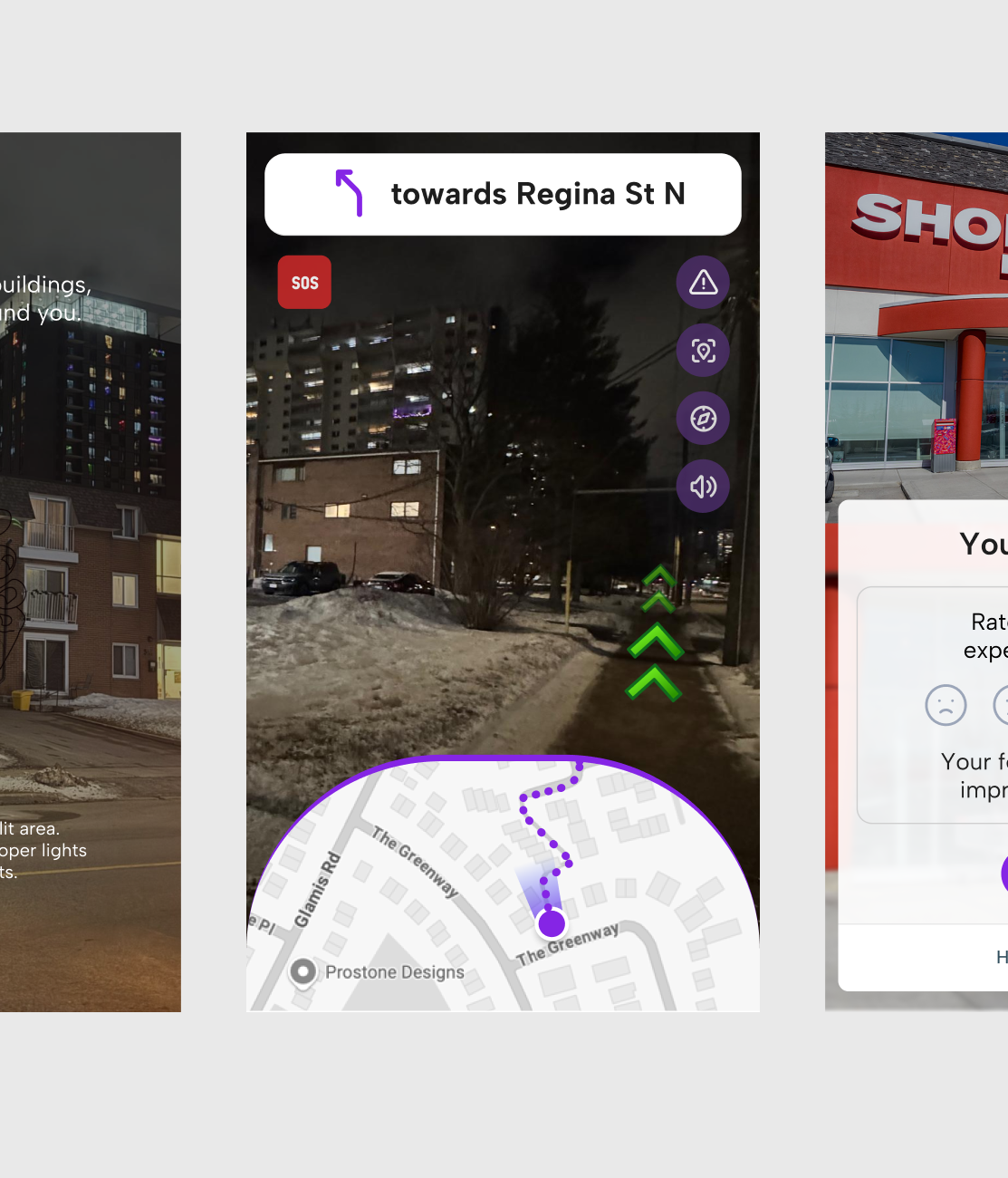
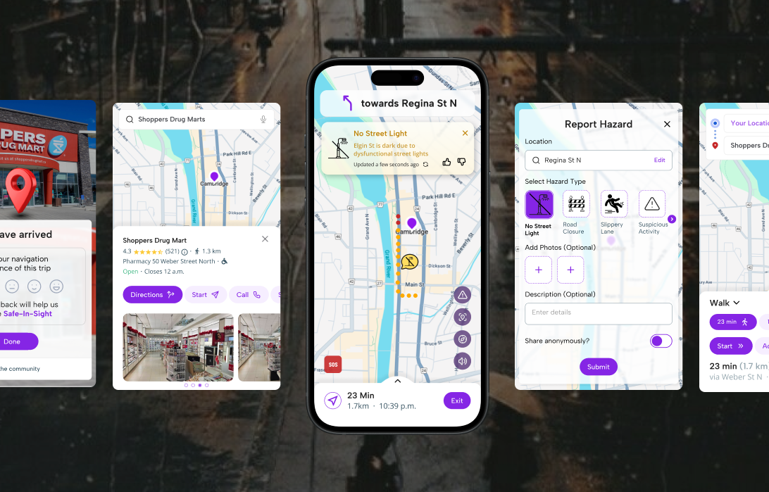
Safe-In-Sight is a mobile-first navigation app designed to prioritize pedestrian and cyclist safety, especially for those walking alone at night. Unlike traditional navigation tools that focus solely on routes and directions, Safe-In-Sight integrates real-time hazard alerts, crowdsourced safety data, and community-supported route planning to empower safer movement in urban and suburban environments.
Client
Safe-In-Sight
Role
UI/UX Designer, Researcher
Location
Canada
Release Date
April, 2025
The Problem
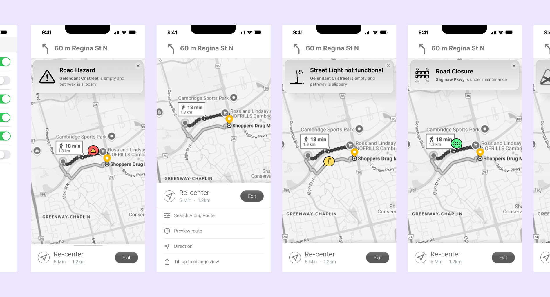
Despite the widespread use of navigation apps like Google Maps, pedestrian safety remains under-addressed, particularly during night walks or in unfamiliar areas.
87% of users rely on Google Maps, yet its safety features are either insufficient or poorly understood.
Google’s “Live View” feature is nearly unusable at night due to low light conditions.
Rerouting is focused on speed, not safety.
Users receive no alerts on isolated roads, poor lighting, or suspicious activities.
34.8% of surveyed users said they actively avoid walking after dark due to safety concerns.
The Goal
To design a mobile app that allows people to walk or cycle with more confidence and control—especially at night or in unfamiliar areas.
Majority of users are unaware of safety tools in current navigation apps
No visual cues for risky or isolated streets
Most users value peace of mind over reaching faster
Users want to be warned before they’re in danger, not after
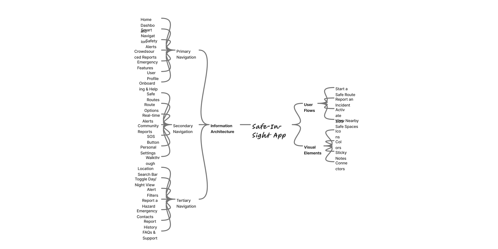
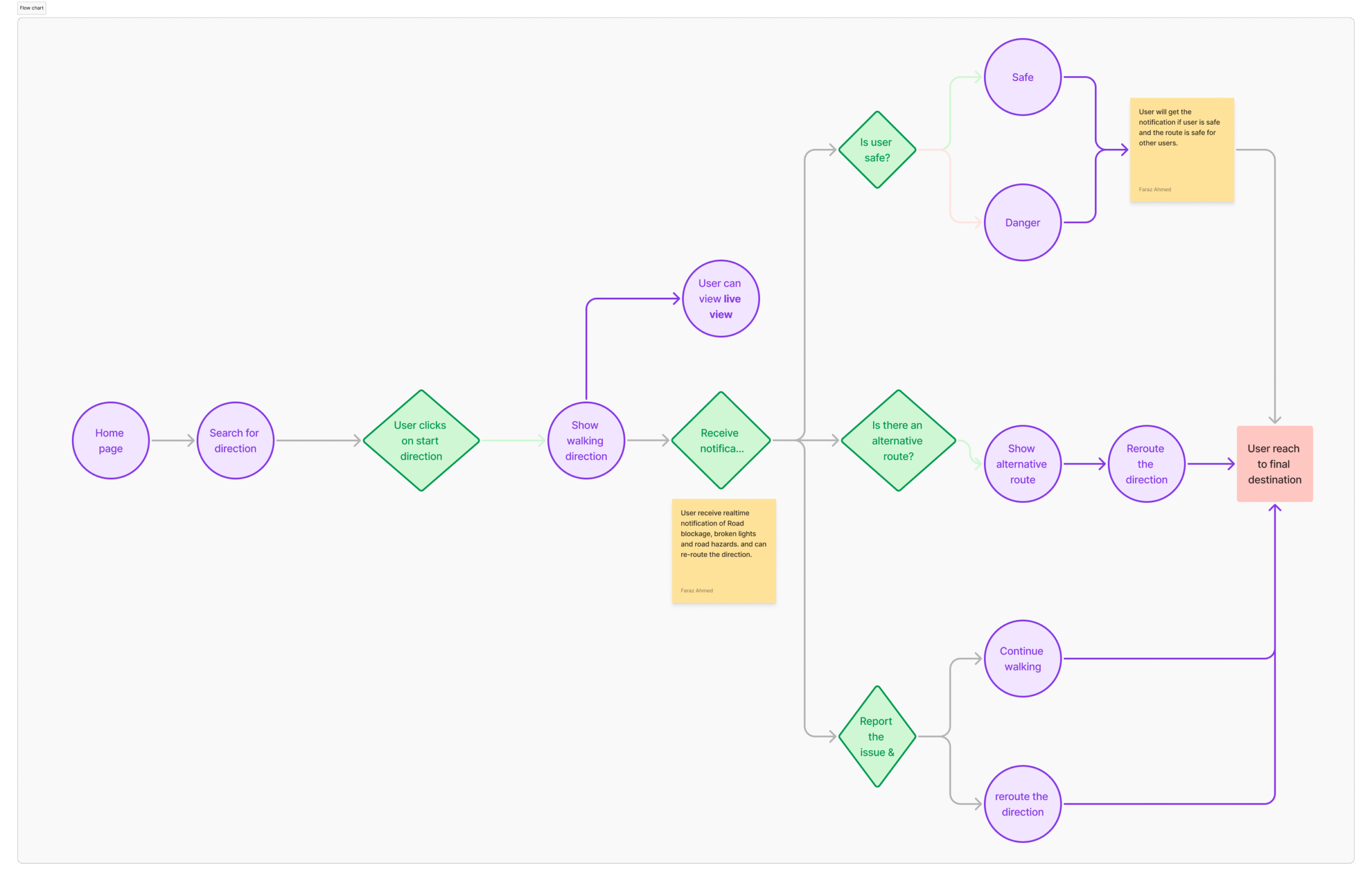
Information Architecture & User Flow
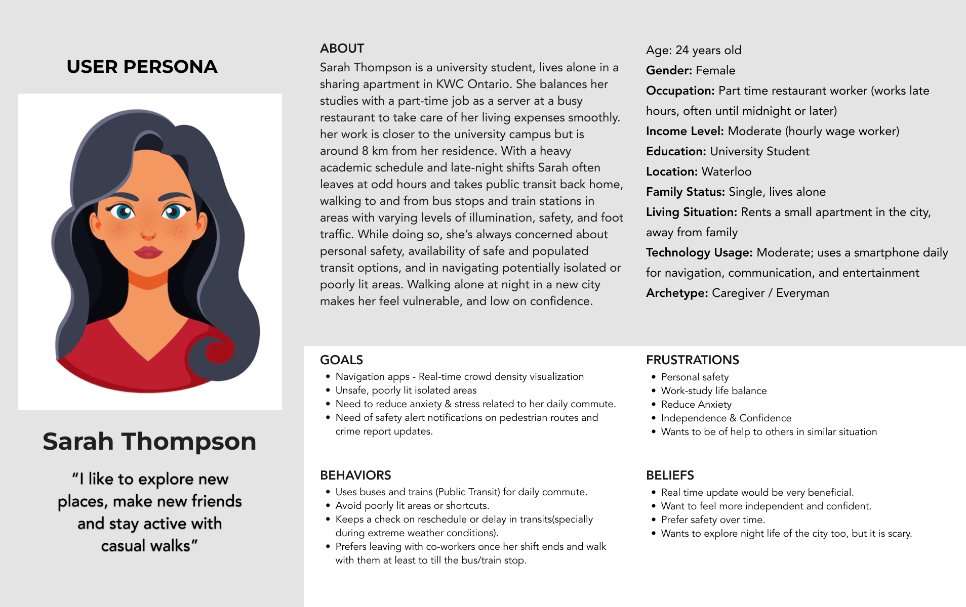
User Persona
Wireframes
Wireframes
Reflection & Takeaways
Designing Safe-In-Sight was more than a UI/UX project — it was a deep dive into how design can respond to real, emotional fears that many pedestrians face daily. The insights gathered through research were eye-opening, particularly around how overlooked pedestrian safety is in our everyday tools. What started as a simple app idea quickly grew into a mission to make walking feel less vulnerable and more empowered.
Key Takeaways:
1. Empathy First, Always
This project reminded me that the best design comes from listening. Through user interviews, I realised how common it is to feel unsafe while walking — especially at night — and how rarely digital tools account for that. Designing for emotional safety became just as important as designing for functionality.
2. Usability ≠ Usefulness
One major finding from usability testing was that users weren’t just looking for pretty interfaces — they needed meaningful, actionable features. The SOS button, safe zones, and simplified hazard reporting had more value to users than flashy animations or micro-interactions.
3. Real-time Context Matters
Designing a product that responds to real-time data (like live reports and safety alerts) challenged me to think beyond static screens. It pushed me to explore how interface elements change based on time, location, and urgency, especially during stressful moments for the user.
4. Crowdsourcing Builds Trust
When users feel they can contribute to their own and others’ safety, engagement increases. Building features that support community participation, like hazard reporting and validation, helped foster a sense of collective responsibility, and that became a core principle of the app.
5. Designing for Calm in Crisis
The emergency flow was a critical learning area. I had to consider what a user might feel during moments of fear or panic, and how to make the design not only intuitive, but comforting and clear. Colour, spacing, and iconography took on new weight in these scenarios.
Final Outcome
Safe-In-Sight is more than a navigation app—it’s a safety-first companion. By combining data, community, and intuitive design, it enables pedestrians to make smarter decisions before stepping out.